What a price chart shows
Welcome to Clerk. In Runner you learned what a futures contract is, how it is priced in ticks and points, and when it trades. Now you learn to read the market’s record: the price chart. Almost every trading screen you will ever see is built around one.
A record of price over time
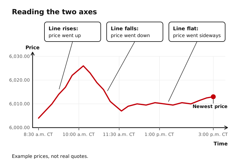
A futures price changes many times a second. If you watched only the last price, you would see a number flickering and have no idea where it came from. A chart solves that by drawing every price on a grid:
- The horizontal axis (along the bottom) is time. Older prices sit on the left, the newest on the right.
- The vertical axis (up the side) is price. Higher prices sit higher on the screen.
So a chart that rises from left to right means price went up over that stretch of time. A chart that falls means price went down. A chart that wanders sideways means price went nowhere in particular.
That is the whole idea. Everything else in this level (candles, timeframes, volume) adds detail to that simple picture.
Why traders rely on charts
CME Group’s technical analysis course calls charts the foundation of technical analysis: they let you see price moves visually, and they are the backdrop on which traders place other tools. In plain terms, a chart does three jobs for you:
- It compresses a lot of information. A whole day of trading fits on one screen. You can see the high of the day, the low, and the path between them at a glance.
- It gives context. Is today’s price high or low compared with yesterday? Was the last hour calm or wild? A single number cannot answer that. A chart can.
- It is a shared language. Traders everywhere look at the same kinds of charts and use the same words for what they see. The rest of LearnToTick, and every trading conversation you join, assumes you can read one.
Two ways traders study a market
CME Group describes two broad kinds of analysis:
- Fundamental analysis looks at the forces behind supply and demand. For the E-mini S&P 500, for example, that could mean the expected earnings of the companies in the index.
- Technical analysis studies the chart itself: the patterns price makes and where price has and has not been able to go.
CME notes that many traders combine the two. LearnToTick does not ask you to pick a side. Whatever approach you end up with, you will need to read a chart, because the chart is where you see what the market actually did.
What a chart cannot do
A chart is history. Every mark on it is a trade that already happened. It does not know what comes next, and no line, candle, or shape on it is a guarantee. In this level you are learning to read charts, the way a clerk reads a ledger: accurately and calmly. You are not learning to predict from them, and nothing in this level is a signal to buy or sell.
Key ideas
- A price chart plots price (up the side) against time (along the bottom).
- Older prices are on the left, the newest price is on the right.
- Charts compress a lot of trading into one picture and give context a single price cannot.
- Fundamental analysis studies supply and demand; technical analysis studies the chart. Many traders use both.
- A chart is a record of the past, not a prediction.