Chart types
In Lesson 1 you saw a chart drawn as a single line. That is only one way to draw price. CME Group’s technical analysis course names three common chart types: line, bar, and candlestick. All three show the same market. They differ in how much of each period’s story they show you.
First, one word you need: a period is the slice of time each mark on the chart covers, such as one minute, five minutes, or one day. You will learn to choose periods in Lesson 7. For now, just know that a chart is a row of periods, side by side.
Line chart: the closing price only
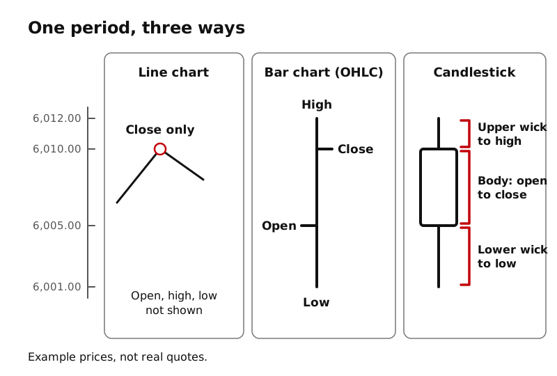
A line chart takes one price from each period, the close (the last price traded in that period), and joins those dots with a line.
- Good for: seeing the general direction over a long stretch of time. CME describes it as a quick way to view a longer trend.
- Missing: everything that happened inside each period. If price shot up and came back down within a period, a line chart never shows it.
Bar chart: four prices per period
A bar chart (also called an OHLC chart, for Open, High, Low, Close) draws each period as a vertical line with two small side marks:
- The top of the vertical line is the high, the highest price traded in that period.
- The bottom of the vertical line is the low, the lowest price traded.
- A small mark on the left is the open, the first price of the period.
- A small mark on the right is the close, the last price of the period.
One way to remember it: you read left to right, so the left mark is where the period started and the right mark is where it finished.
Candlestick chart: the same four prices, easier to see
A candlestick chart uses the same four prices as a bar chart, open, high, low, and close, but draws them differently:
- A thick block called the body spans from the open to the close.
- Thin lines called wicks stick out above and below the body to the high and the low.
Lesson 3 takes the candle apart piece by piece.
Why so many traders use candles
Bar charts and candlestick charts hold exactly the same information. The difference is how fast your eye can read it. On a candle, the open and close are not tiny side marks; they are the two ends of a thick body. That makes two things jump out instantly:
- How far price moved from open to close (the length of the body).
- How far price stretched beyond that, up to the high and down to the low (the wicks).
CME’s course says candles help traders see buying and selling pressure through the size of the body and the size of the wicks. You will practice reading both in Lesson 5. Because candles pack the most information into the most readable shape, LearnToTick uses them for the rest of the course.
None of these chart types is “right”. A line chart is a fine way to see the big picture. A bar chart is fine if you prefer it. They are three drawings of the same trades.
Key ideas
- The three common chart types are line, bar, and candlestick.
- A line chart shows only each period’s close.
- A bar chart shows open, high, low, close: open mark on the left, close mark on the right, high and low at the ends of the line.
- A candlestick shows the same four prices with a thick body (open to close) and thin wicks (to the high and low).
- Candles are popular because the body makes each period’s open and close easy to read at a glance.