Multiple timeframes
In Clerk Lesson 7 you learned that a chart’s timeframe is how much time each bar covers. CME Group’s technical analysis course notes that traders pick timeframes to match their time horizon: a longer-term trader may follow weekly or monthly charts, while a shorter-term trader may use 60-minute or 5-minute charts.
This lesson is about using more than one timeframe on the same market, so a small chart has big-picture context.
Same market, different zoom
Think of a map app. Zoomed in, you see every street on your block. Zoomed out, you see which side of town you are on and where the highway is. Neither view is “right.” You need both to get somewhere.
Charts work the same way:
- A bigger timeframe (daily, 60-minute) shows the broad shape: is the market trending or ranging over days or weeks? Where are the major highs and lows?
- A smaller timeframe (5-minute, 1-minute) shows the detail: exactly how price is moving right now.
The arithmetic of bars
A bigger bar is just a group of smaller bars. Twelve 5-minute bars make one 60-minute bar: 12 times 5 = 60 minutes. The 60-minute bar’s open is the first 5-minute bar’s open, its close is the last 5-minute bar’s close, and its high and low are the highest high and lowest low of all twelve. Nothing new is added. The big bar simply hides the path price took inside it.
And the RTH session from 8:30 a.m. to 3:00 p.m. CT is 6 and a half hours, or 390 minutes. On a 5-minute chart that is 390 / 5 = 78 bars. On a 60-minute chart it is only 6 and a half bars. Same session, very different amount of detail.
Why the bigger picture helps
1. The trend depends on the timeframe
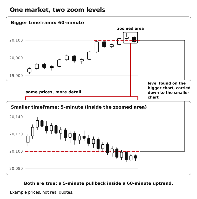
Lesson 2 defined trends with swing highs and lows. Those swings look different on different timeframes. A pullback that looks like a downtrend on a 5-minute chart can be a small dip inside an uptrend on the daily chart. Both are true. Saying “the 5-minute chart is falling inside a daily uptrend” is a much more complete description than either half alone.
2. Bigger levels are easy to miss on a small chart
On a 5-minute chart, older bars quickly scroll off the screen. A swing high from three weeks ago is easy to miss, but it may still be a level traders remember (Lesson 3). CME’s support and resistance lesson gives a related example: a longer moving average on a daily chart reflects longer-term levels that price may reach only every few months. Checking the bigger timeframe first lets you bring those levels down to your working chart.
3. Patterns exist on every timeframe
CME’s course notes that patterns such as ranges and triangles can be found on whatever timeframe you choose. A range on a 60-minute chart can contain many small trends on a 5-minute chart.
A simple top-down habit
One simple way to use timeframes is to go from big to small:
- Biggest first. Look at a daily chart. Name the market type (Lesson 1) and mark any major swing highs and lows.
- Middle next. Look at a 60-minute chart. Name the market type again and add any levels you see.
- Working chart last. Switch to the chart you actually watch (for example 5-minute) with the bigger levels already drawn on it.
Pick a small set of timeframes and stay with them. Flipping through ten timeframes looking for one that “agrees” with what you hope to see is a way of fooling yourself.
What timeframes do not do
Lining up timeframes gives you context, not certainty. Even when every timeframe looks the same, the market can change direction. Timeframe agreement is a description, never a signal by itself.
Key ideas
- A bigger timeframe shows the broad shape and older levels; a smaller timeframe shows the detail.
- A bigger bar is a group of smaller bars: twelve 5-minute bars make one 60-minute bar.
- Different timeframes can describe the same moment differently, and both can be true.
- A top-down habit (daily, then 60-minute, then your working chart) carries bigger levels onto your smaller chart.
- Multiple timeframes give context, not signals.